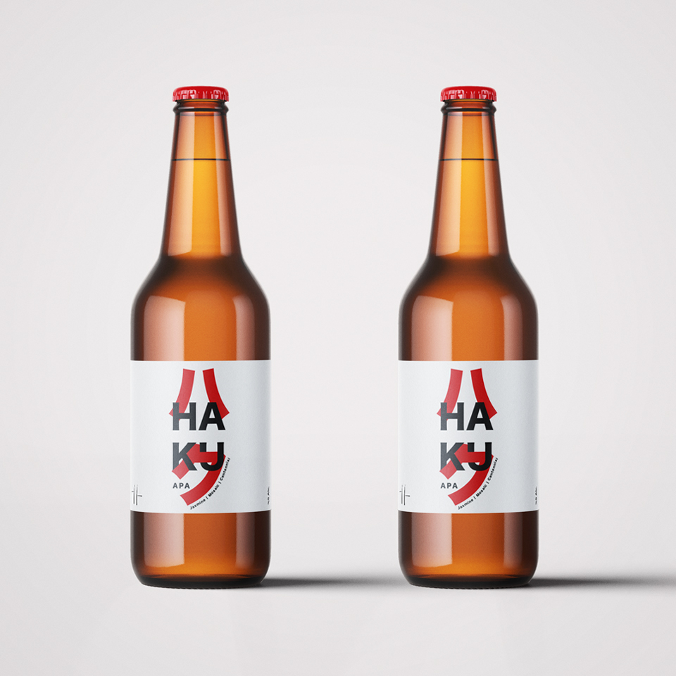
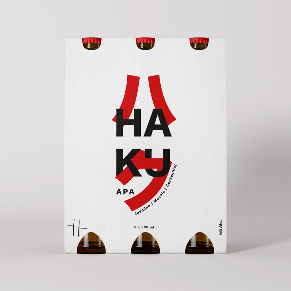
Haku (ハク) APA Beer
Art Direction, Package Design, Print Design
Haku (ハク): Eastern Serenity, Bottled with Western Boldness
Packaging and Label Design for Haku (ハク) Apa Beer – YT Brewing Company.
Deriving from the Japanese word for ‘white‘ or ‘pure soul,’ Haku (ハク) serves as the cornerstone of our design philosophy. For this project with YT Brewing Co., we harmonized the bold character of an American Pale Ale with the minimalist aesthetics of the Far East, effectively turning the liquid into ‘bottled art.’
Moving beyond conventional packaging, we curated a silent yet commanding presence on the shelf. By utilizing modern typography influenced by traditional calligraphy and maintaining a strict visual balance, we aimed to evoke the refreshing experience of the beer before the cap is even lifted.
Created under the creative direction of Halil Gokdal in 2021, Haku APA stands as a modern identity project where flavor is translated into a visual language—a testament to the power of simplicity.
Let´s talk
Always looking for new challenges and interesting partners.
Also, I love to say hello.
Contact